Swyx Analytics for VisualGroups - User Manual
- h.elholm
- Stephan Fischer
Introduction
The SwyxAnalytics offers a wide range of possibilities to analyse the Swyx VisualGroups. On this page you will find a manual of how to design dashboards for analysing the performance of VisualGroups and an overview of all available charts including a description of the algorithm behind the charts.
Getting started
It is very easy to run your first VisualGroups analyses. Just login into the WebSuite and open the dashboard view. Either you click on "Open dashboard" in the dashboard tile or click into the dashboard tab at the right boarder of the WebSuite window. Then click on the "+" symbol in the menu bar of the dashboard an choose the entry "Create dashboard". A new window opens and shows all available template dashboard in a list view at the left side of the window. In our case, we want to analyse our VisualGroups, so we click the entry "VisualGroups Analysis". What happens next is that on the right side the content of the selected dashboard is loading and all the containing charts (widgets) are displayed. Please note the charts don't show real data but some sample data just to give an impression how they will look like. You can also click into the charts to change the view, to hide datasets or to change the chart type.
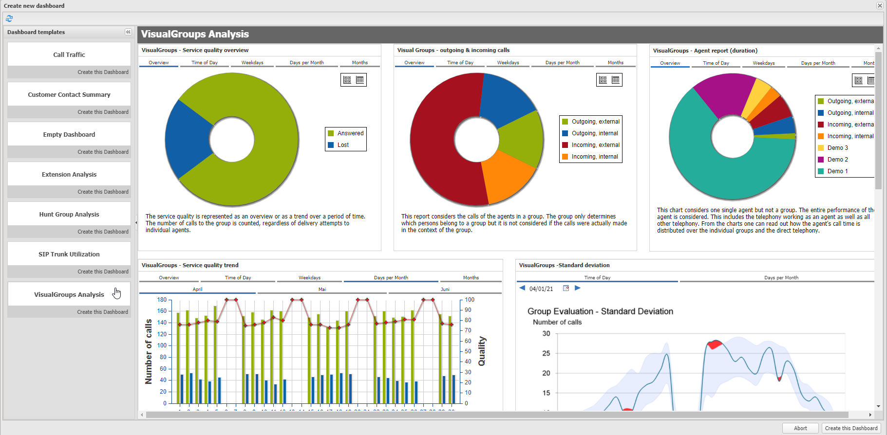
Seeing the charts using sample data is nice but what we actually want is to run the analysis based on our real data. Therefor we have to make our own copy of the template dashboard. This is done by clicking on "Create this dashboard" either within the list view below the selected dashboard item or on the right bottom below the template dashboard.
Now you created you first VisualGroups Analysis dashboard!
The next thing you have to do is to define some configuration parameters. These are:
- Which VisualGroup has to be considered in the analysis
- Which agent has to be considered in the analysis
- What time frame should be analysed
- Probably a meaningful name for the dashboard
All these settings can be done for the whole dashboard and so for every chart within this dashboard. You have to open the configuration area of the dashboard by clicking on the expander symbol in the upper right corner of the dashboard. Then choose the taps according to the setting you want to change. Please ensure that the check box "Apply configuration to widgets" is set on every tap that contains the settings you want to apply to the widgets. After you finished the configuration click the button "Apply configurations to widgets" on the bottom of the configuration area. Now the widgets are reloaded with the new settings.
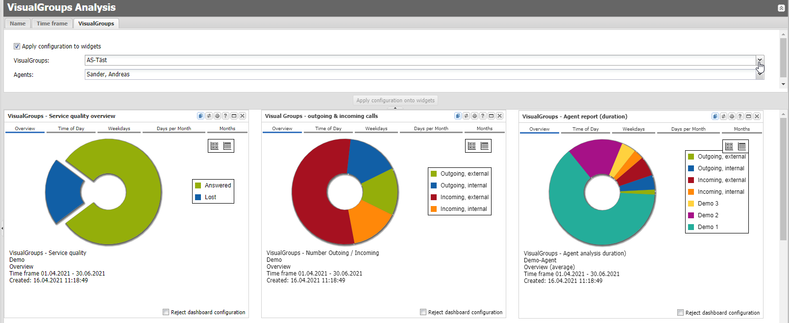
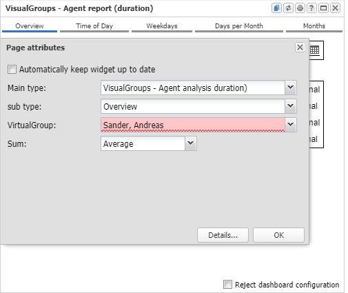
Please note, if the widgets are missing some configuration they will show an configuration dialog or an error message with a hint of what configuration is missing. Please add or change this configuration globally for the whole dashboard like described above or for the single dashboard itself like in this example:
If you're using VisualGroups dashboards and widgets directly after a new setup of the SwyxAnalytics it might be that there is no data processed yet. In that case the widgets are empty. If you want to configure your dashboard anyway you can use the option "use demo data". You find this option in the upper right corner of the dashboard. This option causes that demo data is used instead of real data (which are not available yet). It is much easier to configure a dashboard if one can see how the charts will look like. Please ensure that you disable this option after you have finished the configuration.
Adding a new Widget to an existing Dashboard
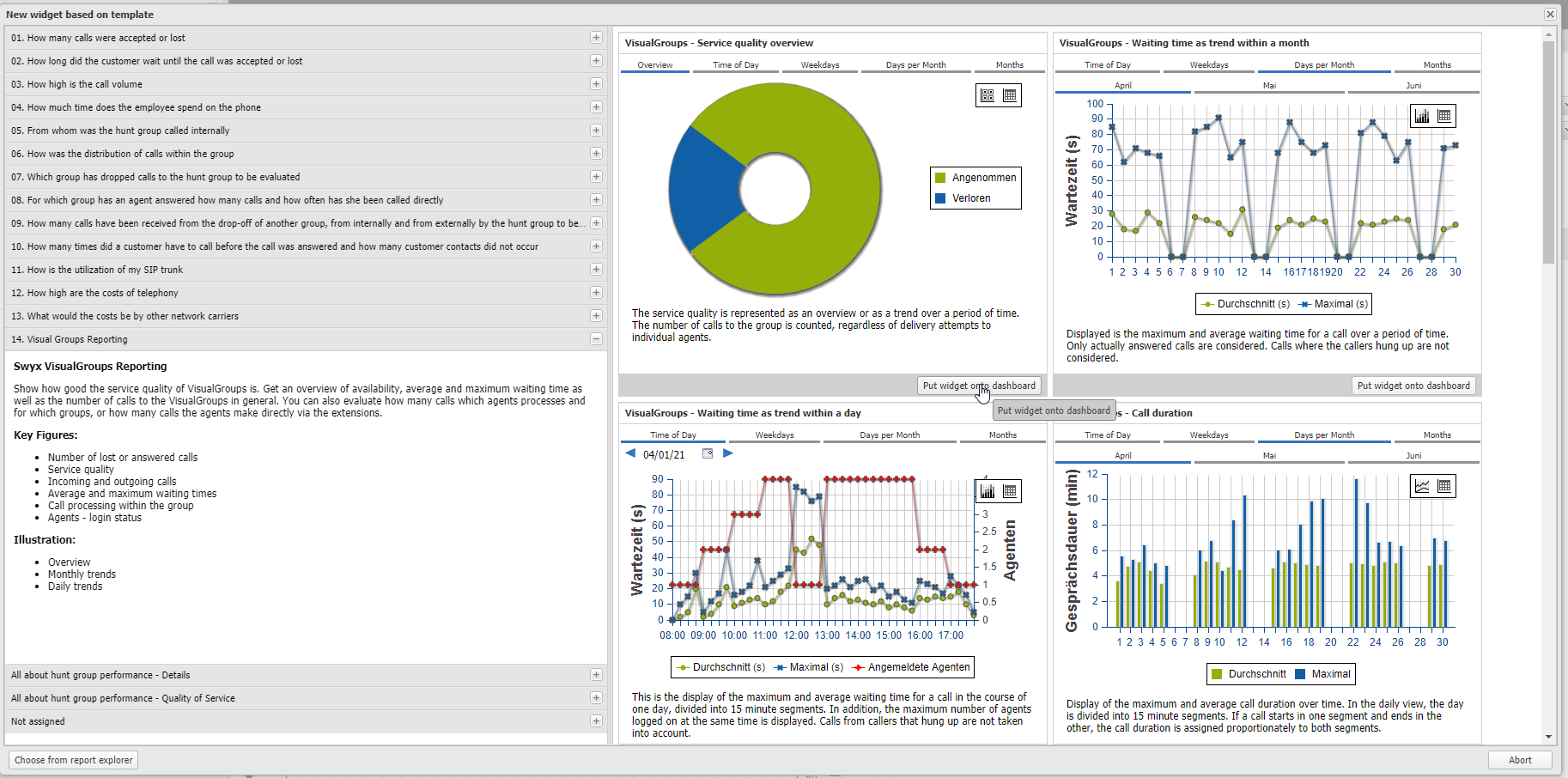
If you have already created a dashboard and you wand to add another widget you can do this very easily: Click on the "+" symbol in the menu bar of the dashboard an choose the entry "Create widget". A widget template window opens which shows a list of categories on the left side and a set of widgets that fits to the selected category on the right side. This is very similar to the template dashboards. Change the selection on the left side and the widgets according to the selection are loaded and displayed on the right side of the window. You also can click into the widgets to change the view, to hide datasets or to change the chart type. If you finally found the chart you were looking for, just add it to your dashboard by clicking "Put widget to dashboard". The selected widget then will be added to the currently opened dashboard. Since we want to analyse VisualGroups select the category "VisualGroups Reporting" and have a look at the widgets represented on the right hand side. Please also note the description of how the data is interpreted within every widget.
If you have applied a new widget to your dashboard that requires some additional configuration parameters that weren't needed yet, this parameters will be added in the dashboard's configuration area in a corresponding tab.
Overview of available Statistic Types for analysing VisualGroups
Waiting time
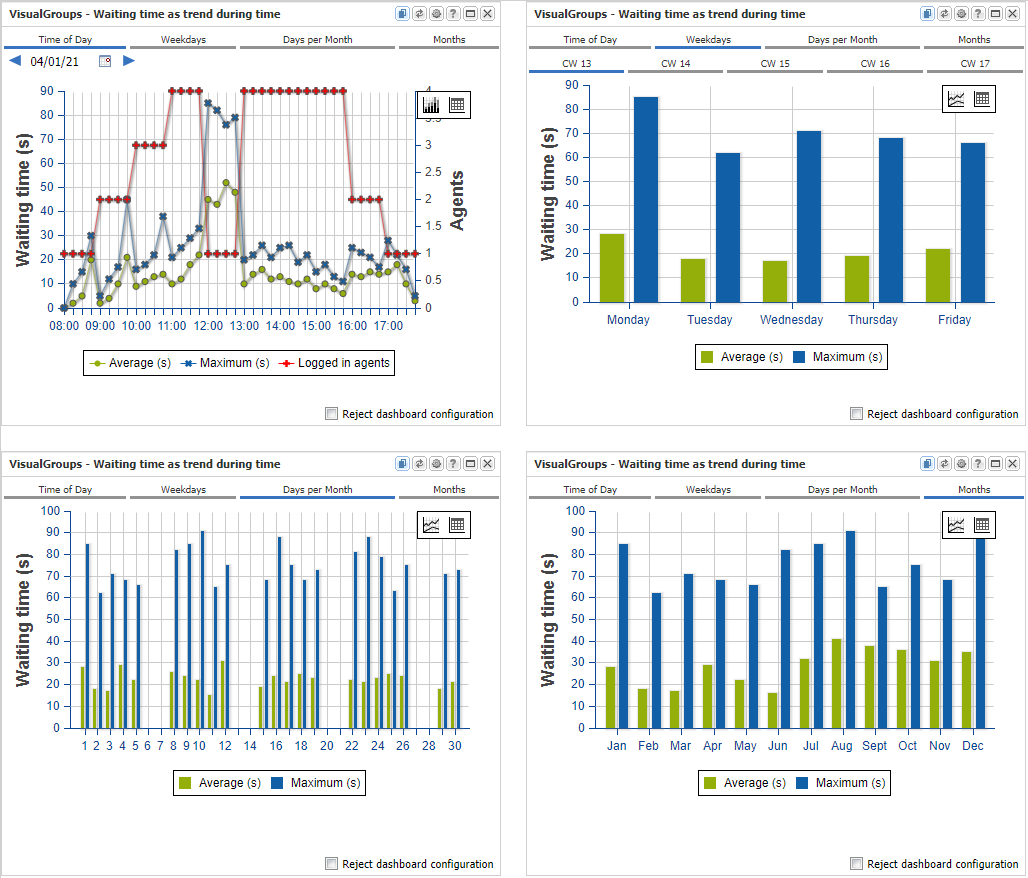
Description
This widgets indicates how long a caller had to wait for an agent to answer. The charts only takes into account the calls that were actually answered by an agent. Callers who hung up during the waiting time are not taken into account here. The calculation for the widget type "Times of Day" differs slightly from the other types.
Time of Day
Strictly speaking, two evaluations are displayed in on chart. On the one hand the number of registered agents (red line, Y-axis right) and on the other hand the average and maximum waiting time of the callers (green / blue line, Y-axis left). The two evaluations are superimposed for information purposes, but there is no dependency in the calculation of the values between the evaluations.
The red line shows how many agents were logged on at the same time anytime within a 15-minute segment. No statement is made as to whether these agents were logged in simultaneously for the entire 15 minutes or just for a short time (it could be just for a second). Likewise, no statement is made about whether the agents were available for answering calls or not. Furthermore, no statement is made about whether it was the same agents for the entire 15 minutes or whether they changed within this time.
The green and blue lines indicate how long a caller had to wait within a 15 minute segment for an agent to answer. If the waiting time exceeds a 15-minute segment, the waiting time is divided between the corresponding segments. The maximum value for the waiting time per segment is therefore 15 minutes. If the value 15 minutes is reached in the diagram, then a participant has waited the entire 15 minutes of this segment, possibly longer but by no means shorter.
The chart does not make any statement about how many callers the waiting time was distributed among and so no statement about the utilization of the waiting queue can be made.
Weekdays/ Days per Month/ Month
The calls are assigned here as a whole to a day. This is the case even if the conversation went past midnight. The call is always assigned to the day/month on which it started. Since the calls are not split up, there is no upper limit for the waiting time.
Call Duration
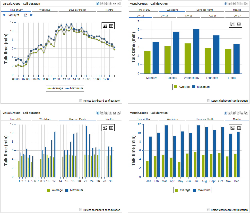
Description
Here the average and maximum length of calls are aspect of the statistic. The display type "times of day" is calculated a little differently than the other types, which is why they are also described separately here.
Time of Day:
Der Tag wird hier in Segmente von jeweils 15 Minuten Länge aufgeteilt. Maximum und Durchschnitt werden also für jeweils ein 15 Minuten Segment gebildet. Da ein Gespräch durchaus länger als 15 Minuten dauer kann, wird es über die einzelnen Segemente verteilt, wenn dies notwendig sein sollte.
The day is divided into segments of 15 minutes each. The maximum and average call duration are therefore calculated for a 15-minute segment each. Since a conversation can last longer than 15 minutes, it is distributed over the individual segments if this should be necessary.
Example:
A call begins at 9:08 a.m. and lasts twenty minutes.
The following values could then be seen in the diagram:
- 9:00 7 minutes
- 9:15 13 minutes
This means that the maximum value that can appear in the diagram is 15 minutes. The closer the figure in the diagram gets to 15 minutes, the longer the conversation was. The value of 15 minutes is reached when a conversation lasted for the entire 15 minute segment. This representation shows how long the phone call was made within a 15-minute segment, but not how long the conversation lasted in total.
Weekdays/ Days per Month/ Month
The calls are assigned here as a whole to a day. This is the case even if the conversation went past midnight. The call is always assigned to the day/month on which it started. Since the calls are not split up, there is no upper limit for the waiting time.
In general
Only calls that have been answered by an agent are used to determine the duration of the calls. Unanswered calls therefore do not change the average. The diagrams do not take into account whether the calls took place simultaneously or one after the other. It is also not taken into account whether the calls were accepted by the same or different agents. This chart therefore can't be used to draw any conclusions about the utilization of the agents or the VisualGroup.
Waiting Time in Queue over Time
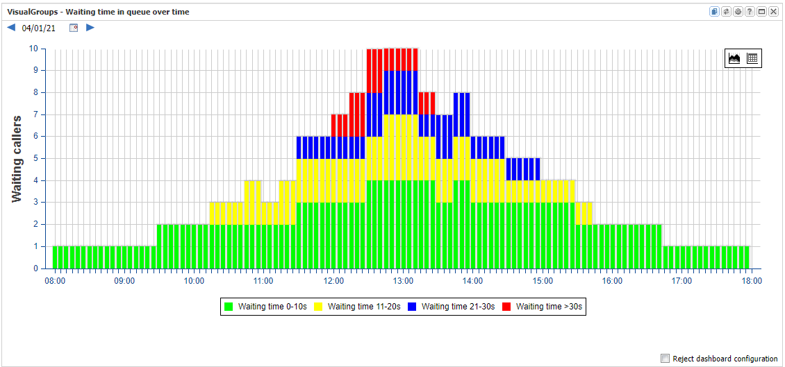
This analysis shows how many callers are waiting in the queue at the same time and how long they wait. This chart is only available for a specific day. Longer periods or averages are not possible.
The length of the queue and the waiting time of the callers could change every second. However, the resolution of the diagram is limited so that not every second can be displayed. The display is therefore reduced to a maximum of 120 bars. If a whole day is shown, one bar corresponds to 12 minutes and, if 10 hours are shown (e.g. 8 a.m. to 6 p.m.), 5 minutes each.
Within the time span of one bar, the respective second is displayed in which the maximum number of waiting callers was. If there are several seconds with the same amount of waiting callers, the second that contains the callers with the longest waiting time is selected.
The chart contains calls that were answered and calls in which the caller gave up.
Service Quality
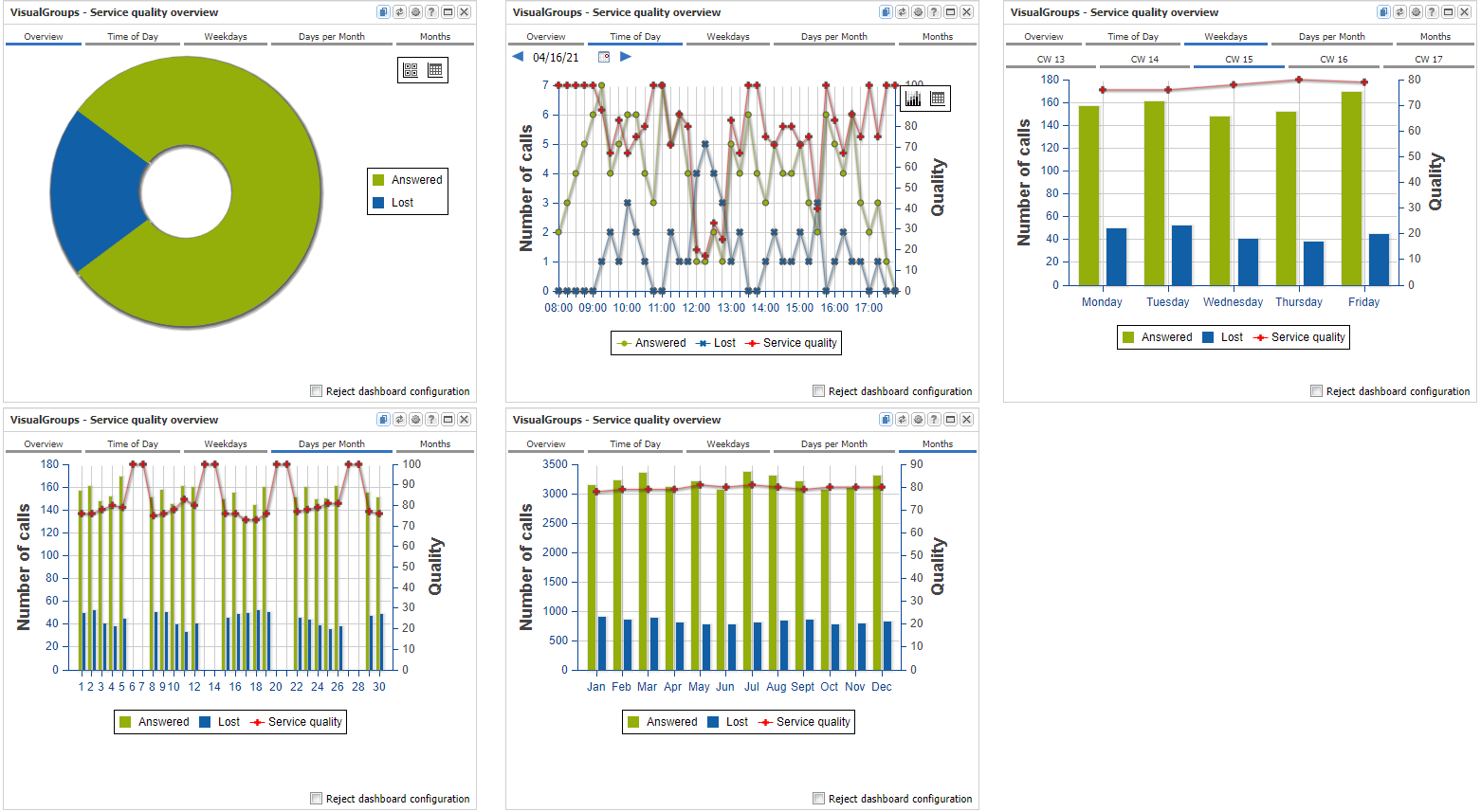
This statistic shows the ratio of accepted calls to lost calls.
In the chart type "Time of Day", the day is divided into 15 minute segments. The chart shows the total of accepted and lost calls within a 15 minute segment. In the case of accepted calls, the time at which the call was answered determines the assignment to the diagram and, in the case of lost calls, the time at which the caller hung up. In the end, this is always the point in time when the waiting time for the caller ends.
The service quality is calculated according to the formula: number accepted / (number accepted + number lost). If there have been no calls at all, the service quality is 100%
The statistics can be shown either with detailed or with average values. In the case of a detailed values, a specific day / month is considered, whereas in the case of average an average is created over the entire time period.
Amount of outgoing & incoming Calls
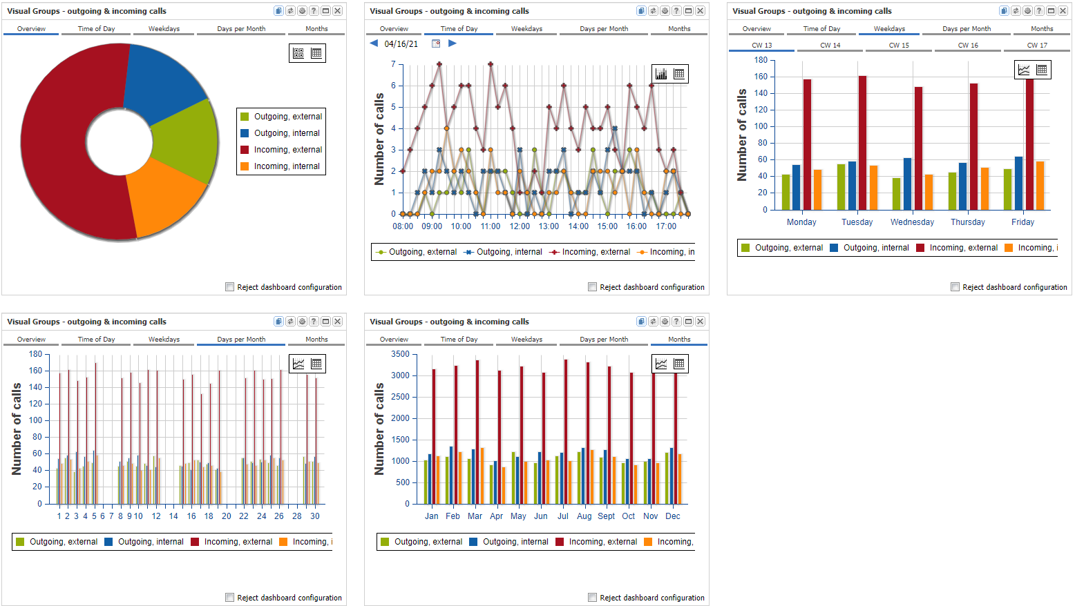
This statistic looks at the calls of the agents in the selected group. The calls are divided into four types of calls:
- Outgoing calls to an external number
- Outgoing calls to an internal subscriber
- Incoming calls from an external number
- Incoming calls from an internal subscriber
Calls that are relevant for this statistic only indirectly has something to do with the selected VisualGroup. The group is used to identify the subscriber that belongs to the group. Then all call coming and going calls from and to the extensions of these subscribers are considered within the statistic. The statistic does not take into account whether the calls were actually made in the context of the group. For this reason, the times in which an agent logged on to or logged off from a group are not taken into account here. If an agent is assigned to several groups, the calls made for all groups are taken into account, even if these groups were not selected in the configuration of this statistic.
All calls made from the agents of the group are taken into account individually and are not put into any context.
Example:
An agent is called from an external number. Since the agent can't answer the caller's question, he queries an internal subscriber and ultimately transfers the call to this subscriber.
There are now several calls considered in the chart: On the one hand an incoming call from the external number and on the other hand an internal outgoing call to the subscriber to whom consultation was required. If the subscriber to whom the call was transferred is also an agent of the selected group, two further calls are included: an internal incoming call (the query, but this time from the perspective of the second agent) and a further external incoming call (the call leg from after the transfer).
The statistics can be shown either with detailed or with average values. In the case of a detailed values, a specific day / month is considered, whereas in the case of average an average is created over the entire time period.
The call data of the VisualGroup calls do not contain any information about the call direction. The direction of the calls is therefore determined by merging the VisualGroups data with the Swyx CDRs. A correct call direction - and thus a correct internal / external classification - is therefore only available after the call data from VisualGroups and the Swyx CDR have been imported.
The direct calls that are not made via a group are determined from the Swyx CDR. However, these calls are only processed for the subscribers who are known as VisualGroups agents. This information is retrieved directly from the VisualGroups configuration. If the VisualGroups configuration has been changed, e.g. new agents were added to a group, direct calls to and from this agents are only considered in the statistic after the new configuration has been read in again by the program. This is the case after about every minute.
Agent Report - answered & lost Calls
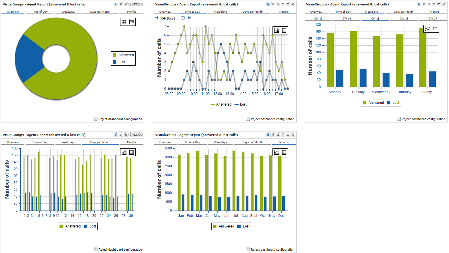
This chart considers a single agent. Her telephone activities is analized exclusively in the context of her work as an agent of any group in which she was active. Only calls which caused at least one ring signal at the agent's extension are counted here. In the configuration, you can select whether the statistic algorithm should use multi-signaling or not. This means the following:
Algorithm with multi-signaling option:
If call forwarding is used or in case it is a group with parallel call distribution, one and the same call can be signaled to several agents. In this case, the call is saved for all the agents. One and the same call can therefore be saved as a lost call for one agent and as an accepted call for to other agent. It might be also possible that a call is saved several times by one agent, for example if a call forwarding switches the call back and forth between two agents.
Algorithm without multi-signaling option:
Each call is stored exactly once. The agent where the call was last signaled gets the call counted. It is not relevant how many call transfers have taken place between agents.
The statistics can be shown either with detailed or with an average view of the data. In the case of detailed view, a specific day/month is considered, whereas in the case of average an average is created over the entire time period.
Agent Report - Call Duration
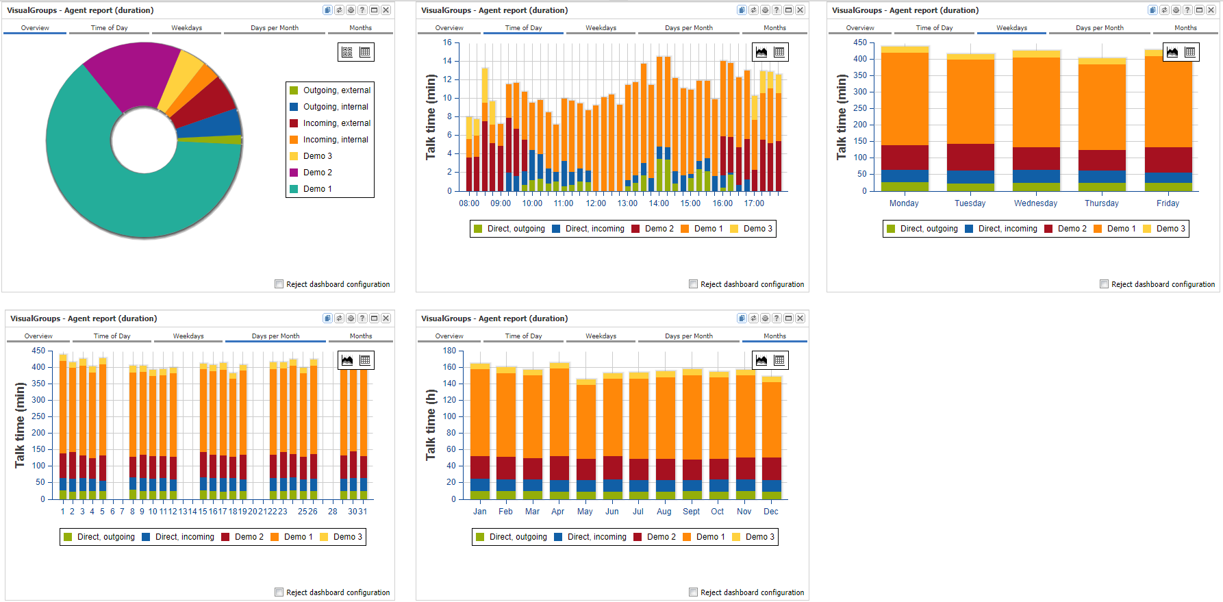
This chart also looks at a single agent. However, his entire telephone activities are taken into account. This includes both: the calls made within the work as an agents as well as the calls made outside of this work. The charts show how the agent's call time is distributed across the individual groups he is working for and the direct calls to and from the agent's extension. The statistic type "Time of Day" contains one segment per 15 minutes. Calls that exceed a segment limit are distributed over the corresponding segments. If the call duration reaches the maximum value of 15 minutes, the agent has made a call for the entire time in this time segment.
Please note that in the statistic type "Overview" direct calls are divided into four groups (outgoing external, outgoing internal, incoming external, incoming internal) but in the other subtypes only into two groups (outgoing, incoming). This restriction was made to reduce the number of segments in the bar charts to keep it readable.
The statistics can be shown either with detailed or with an average view of the data. In the case of detailed view, a specific day/month is considered, whereas in the case of average an average is created over the entire time period.
The direct calls that are not made via a group are determined from the Swyx CDR. However, these calls are only processed for the subscribers who are known as VisualGroups agents. This information is retrieved directly from the VisualGroups configuration. If the VisualGroups configuration has been changed, e.g. new agents were added to a group, direct calls to and from this agents are only considered in the statistic after the new configuration has been read in again by the program. This is the case after about every minute.
Agent Report - Group Relational
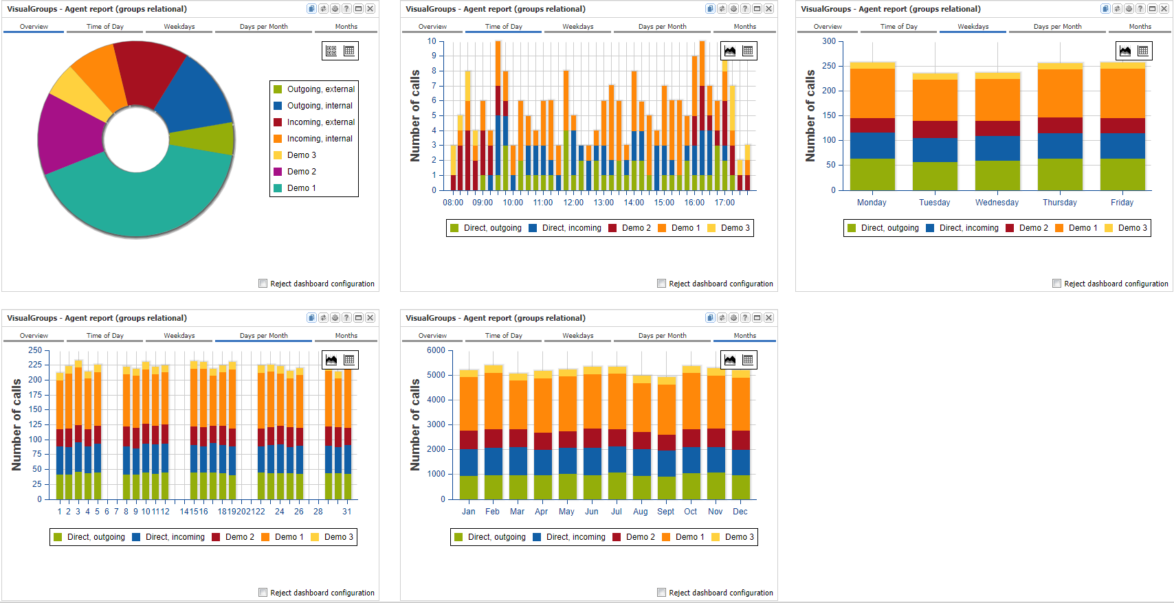
This statistic is actually the same as the statistic "Agent Report - Call Duration" from above but with the difference that here the amount of calls are displayed in the chart not the call duration. The chart shows the number of calls made during the time period. Only calls that were actually answered are counted. Lost calls are not considered.
The statistics can be shown either with detailed or with an average view of the data. In the case of detailed view, a specific day/month is considered, whereas in the case of average an average is created over the entire time period.
The direct calls that are not made via a group are determined from the Swyx CDR. However, these calls are only processed for the subscribers who are known as VisualGroups agents. This information is retrieved directly from the VisualGroups configuration. If the VisualGroups configuration has been changed, e.g. new agents were added to a group, direct calls to and from this agents are only considered in the statistic after the new configuration has been read in again by the program. This is the case after about every minute.
Call Traffic Standard Deviation
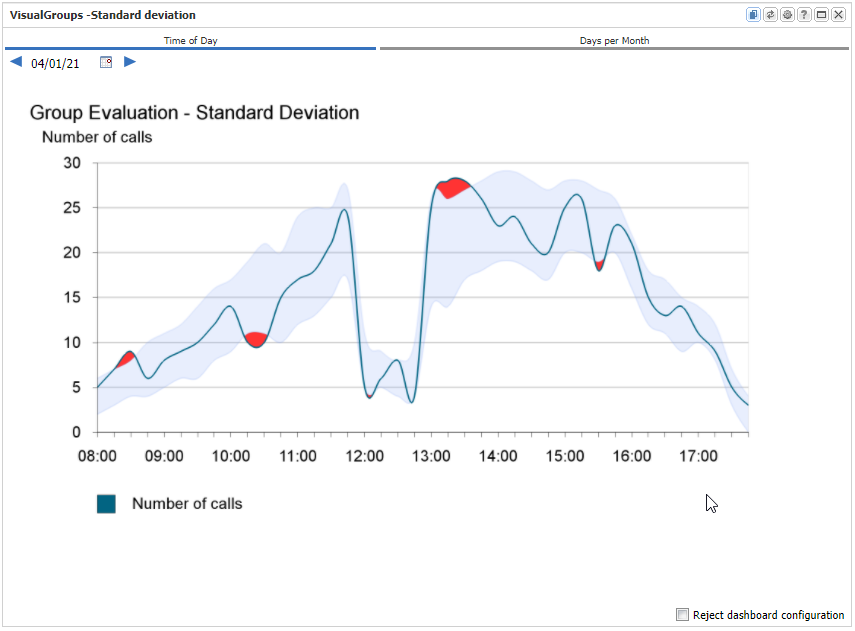
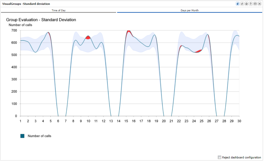
In this chart, the number of calls of a specific day or a specific month is compared with the average number of calls of a reference period. The average and standard deviation are calculated for the reference period and shown as a blue area. The amount of calls of the particular day or a month are plotted as a blue line. If this line leaves the standard deviation area, this area is drawn as a red area. Average and standard deviation are calculated per each weekday. The number of calls of a Monday, for example, are therefore only compared with other Mondays. Public holidays are handled like Sundays. Only days on which at least one call was made are used for the calculation. Days without calls therefore do not change the average and standard deviation.
Lost calls and outgoing calls are not considered. Also only the calls that were made in the context of the group are considered. If an agent was called directly to it's extension, this calls are not taken into account.
The reference period is the period set in the dashboard's or in the widget's "Time Frame" settings. As the statistic type either a day or a month is selected for display.
Amount of Callers in the Queue
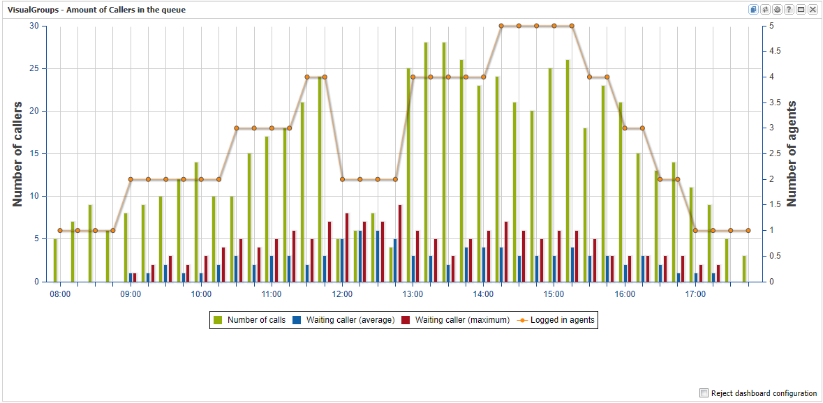
Number of calls: The number of incoming calls for this queue. This includes both answered calls and dropped calls. The chart divides the day into 15 minute segments. The call is assigned to the segment in which the call first appeared in the queue. The duration of the waiting time or the duration of the call is not taken into account in this value.
Waiting callers (average): The average number of waiting callers per 15 minute segment. If the waiting time exceeds the limit of a 15-minute segment, the waiting time is divided among the individual segments accordingly. The waiting time is calculated here to the second.
Example: If there is only one caller in a 15 minute segment and he waits 7 min 30 sec in this segment, the average number of waiting callers is 0.5.
Thus, the following applies to the formula for the average number of waiting callers: Waiting time over all callers/15 minutes.
Waiting callers (maximum): This is the maximum number of callers waiting at the same time. This does not indicate how many callers were waiting in a 15 minute segment in total, but the maximum number of callers waiting at the same time. In other words, it is the maximum queue size in this 15 minute segment.
Example 1: One caller waits from 8:00 to 8:05 and another from 8:06 to 8:11. Here the maximum number of waiting callers in this 15 minute segment is 1
Example 2: One caller waits from 8:00 to 8:05 and another from 8:03 to 8:08. In this case, the maximum number of waiting callers in this 15 minute segment is 2
The average number of callers waiting is 0.7 in both cases (rounded).
Logged in agents: The maximum number of agents that were simultaneously logged in for this group within a 15-minute segment.
The statistics can be shown either with detailed or with an average view of the data. In the case of detailed view, a specific day/month is considered, whereas in the case of average an average is created over the entire time period.
Agent Status
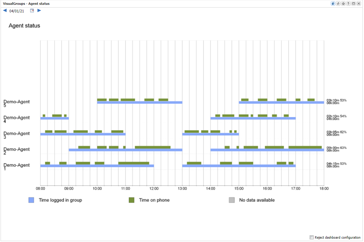
Behind each line a summary is displayed:
- maximum of 15 agents are shown in the chart
- Logged-in time in hours:minutes
- Total call duration in hours:minutes
- Percentage of call time to logged-in time
This statistic always shows a particular day and a particular group. Averages or long-term observations are not possible.
Related content
© aurenz GmbH 2022